Portfolio of Selected Top Funds for 10 years Investment
We have randomly selected 5 funds from the set of predicted top performing funds for 10 years. We have analyzed their performance for current year on daily basis and shown it using bar plot and histogram. The correlation between these funds is visualized using heat map. The data for the daily basis fund reurns is collected from Yahoo Finance.
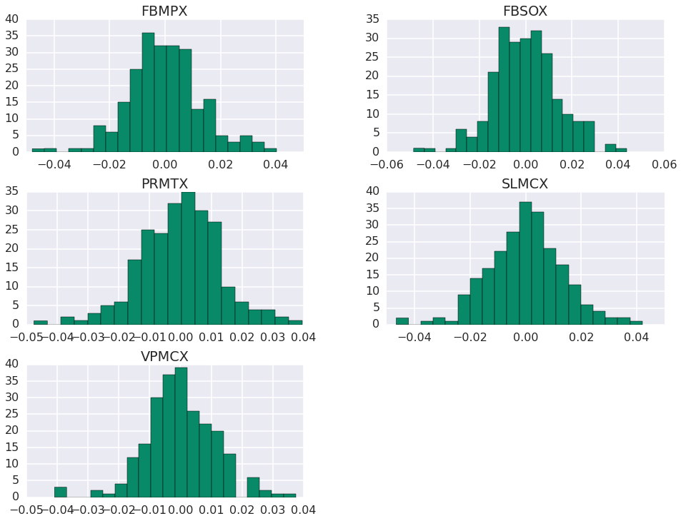
Histogram of the Selected Top Performing Funds
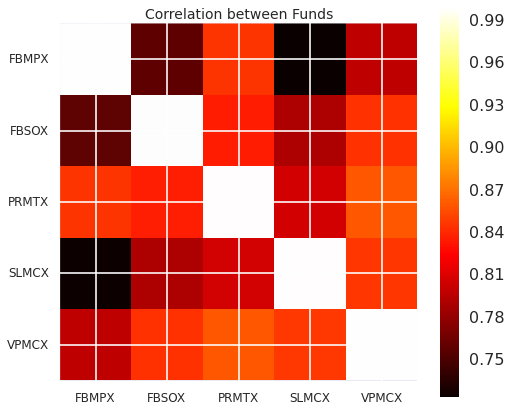
Correlation Between the Selected Top Performing Funds
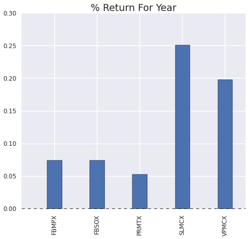
Returns of the Selected Top Performing Funds
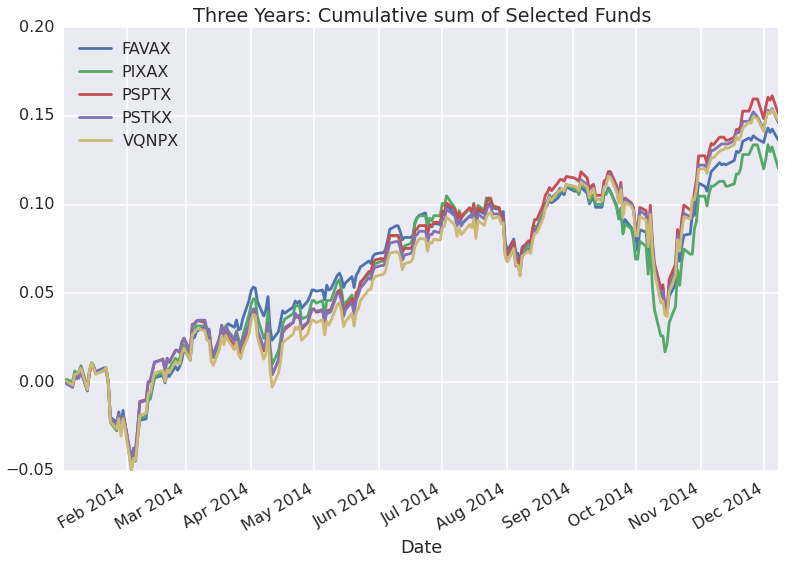
Cummulative Sum of Portfolio for the Selected Top Performing Funds